Words make experiences work. As the importance of UX design has grown, so too has the importance of UX writing. In our latest Zeitspace Session, UX designer Matthew Reynolds and I looked at how creating a UX writing guide can contribute to better design.
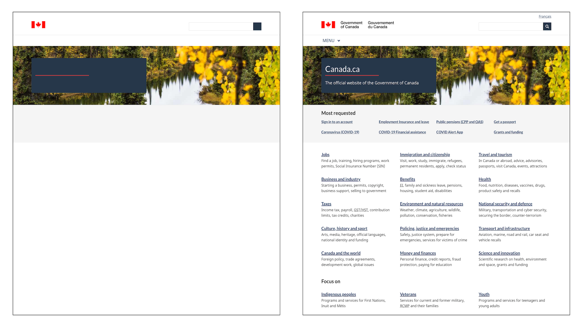
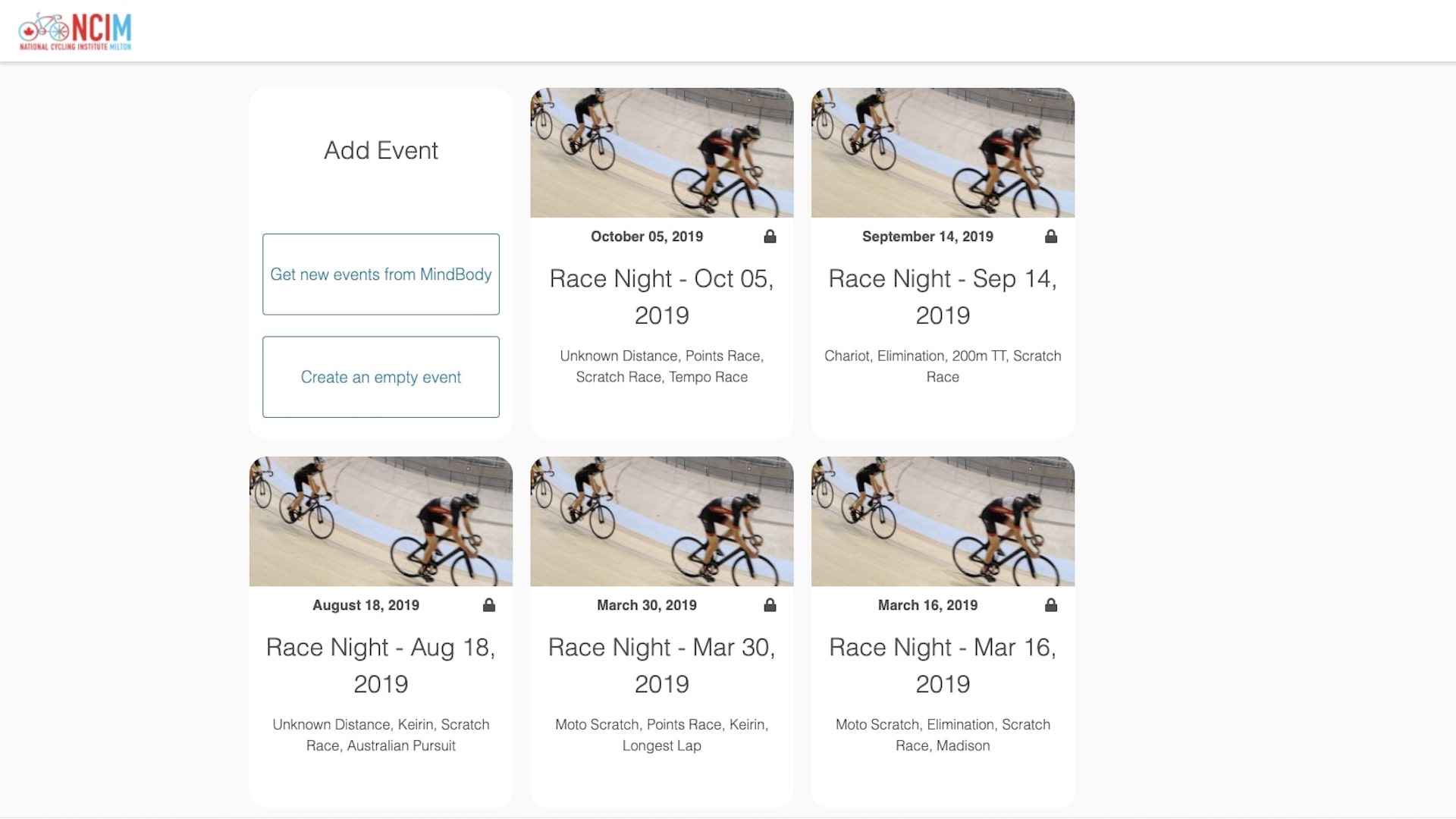
We kicked off the session by looking at the heavy lifting words do in some user interfaces — a banking site, a login page, and a government home page. What we wanted workshop participants to notice was that you can’t really separate UX writing from good design because good writing is good design.
But what is UX writing? UX writing is the process of creating words for digital products or services. It can include button text, error messages, dialog text, and onboarding information. It should always be clear, helpful, and appropriate for the situation.
UX writing isn’t marketing writing, such as company website pages, e-books, blogs, social media posts, or whitepapers. And it’s not technical writing either. UX writing is all about helping move users through an experience and meet their goals. Marketing writing is more about the brand and while it can be clever, that may not work for UX writing. Technical writing could include jargon or focus on being really precise, which, in UX writing may not be appropriate for the situation.
When the words don’t work well, neither does the experience. If UX writing is doing its job, you likely won’t notice the words — the writing, visual design, and interaction design work together to create a great experience. But when the writing isn’t clear and the user doesn’t know how to move forward, then the experience can become frustrating.
UX writing guides can help everyone think about writing in an intentional way — whether or not it’s your job. We created our own UX writing guide at Zeitspace because we wanted our writing to be consistent. We work on a variety of projects for a variety of clients and one thing we noticed was that there wasn’t always consistency in the style of writing across projects and designers. For example, on one project we’d use title case for button labels, in another we’d use sentence case. There were other little differences between designers, too. We wanted to tighten those things up and get consistent by creating a UX writing guide.
(Our process for creating a UX writing guide at Zeitspace)
We created a UX writing guide doing what we usually do when starting a project — research. We looked at what other design teams were doing for UX writing specifically, and within their content design guides more generally. We also read a bunch of helpful books about UX writing and talked about UX writing as a team — what did we want to get out of a writing guide? Next, we created an empty guide with topics from other guides we found helpful. And then we spent more time talking. We went through each topic to decide whether we either wanted to defer to an existing guide on that particular topic, or whether we wanted to do something different. If we decided to do something different, we noted that in our own guide. Because a writing guide is a living document, we’ve also updated it when we encountered something that isn’t covered.
Looking back, perhaps the smartest thing we did was to keep our UX writing guide simple. If we could refer to an existing style guide, we did. In our case, we use the Canadian Press style guide as the basis for our journalistic writing so we commonly referenced it. And a word of caution here: Don’t fall into the trap of trying to make your UX writing guide look like one which has taken an entire team years to create. It doesn’t need to be that involved to be useful.
We talked a lot about UX writing during the workshop, but we also practiced UX writing, too.
The workshop included two activities, which you can access with step-by-step instructions on GitHub. First, we had participants fill in a chart of the voice and tone for a fictional transit app. The activity is based on an exercise from Torrey Podmajersky’s Strategic Writing for UX. The goal was to help relate voice and tone to more concrete and familiar aspects of writing.
In the second exercise we asked participants to rewrite a sentence with four key UX writing principles in mind — writing with purpose, writing concisely, writing conversationally, and writing clearly.
We also spent some time talking about the difference between voice and tone, and how they work together. We decided to focus a bit on voice and tone because they can be tricky concepts to define and understand. There are a few ways we’ve come across to help you understand voice and tone.
Writing is Designing describes voice like your personality (e.g., outgoing, adventurous, reserved) whereas tone is the emotion you apply to your personality in different situations (e.g., happy, frustrated, serious). While your emotions (and tone) change based on your mood, your personality (or voice) will always stay the same.
Another helpful analogy comes from Strategic Writing for UX: “When I overhear my mother answer a phone call, I can quickly tell by her tone whether the call is from a stranger or loved one — but I am never confused that it is my mother’s voice.”
In general, your voice will stay the same, but your tone will change based on what is happening within your product or service. You can imagine a banking app having a professional and supportive voice. But the tone of the writing may change dramatically as the situation changes. If you’ve just been approved for a mortgage, the tone is celebratory. But that tone changes if the bank is telling you their security was breached and your data may have been stolen.
We ended the workshop by giving participants a UX writing template we created that includes topics from well-established industry writing guides, but that they can easily adapt for their own organizations.
Some of the template headings include:
- voice and tone
- grammar and mechanics, so things like punctuation, capitalization, numbers
- readability and accessibility, which offers some guidance around best practices as it relates to plain language, label forms, and alt text
The template also has prompts or questions to guide discussions. But, as we told those in the workshop, you don’t have to create your own UX writing guide from scratch. We’ve referenced some writing guides that you can use as a starting point. When you come across something you don’t agree with, discuss it with your team and note it in the UX writing guide template. Soon, you’ll end up with a UX writing guide tailored to your product and team.
We love sharing what we’ve learned. Sign up to find out about our next Zeitspace Session.


