Darren Kropf’s perspective of streets changed when he became a parent. Pushing a stroller along a sidewalk that constantly sloped as driveways cut across toward the road and crossing the street with an infant made him feel vulnerable.
If he was walking alone and had to jump out of the way of a car, he could easily do so, but not with a stroller in front of him.
“You are exposed and typically the stroller goes in front so it’s the kid that actually goes out onto the street first. Not only are you terrified for yourself, but you’re terrified for your child. That level of vulnerability is something we really need to think about when it comes to pedestrian design,” said Kropf, the City of Kitchener’s active transportation planning manager.
“My big pet peeve in street design is the thinking that as long as you have a sidewalk a street is good for pedestrians.”
Kropf talked about the City of Kitchener’s new approach to designing streets for people at October’s uxWaterloo virtual meetup.
If you asked a transportation designer 40 years ago what streets were for, they’d probably say cars.
“Everything else was considered a ‘nice to have,’ ” said Kropf.
But about 10 years ago, that thinking began to shift toward more holistic design. And that creates a challenge: How do you design for so many different users? What happens when the design works really well for one user, but not at all for another? How do you prioritize when you’re designing around competitive needs and wants?
“The reality is everyone needs to get around a city,” he said.
That means that yes, streets are still for cars, but they’re also for pedestrians, cyclists, community, protests, business, and art.
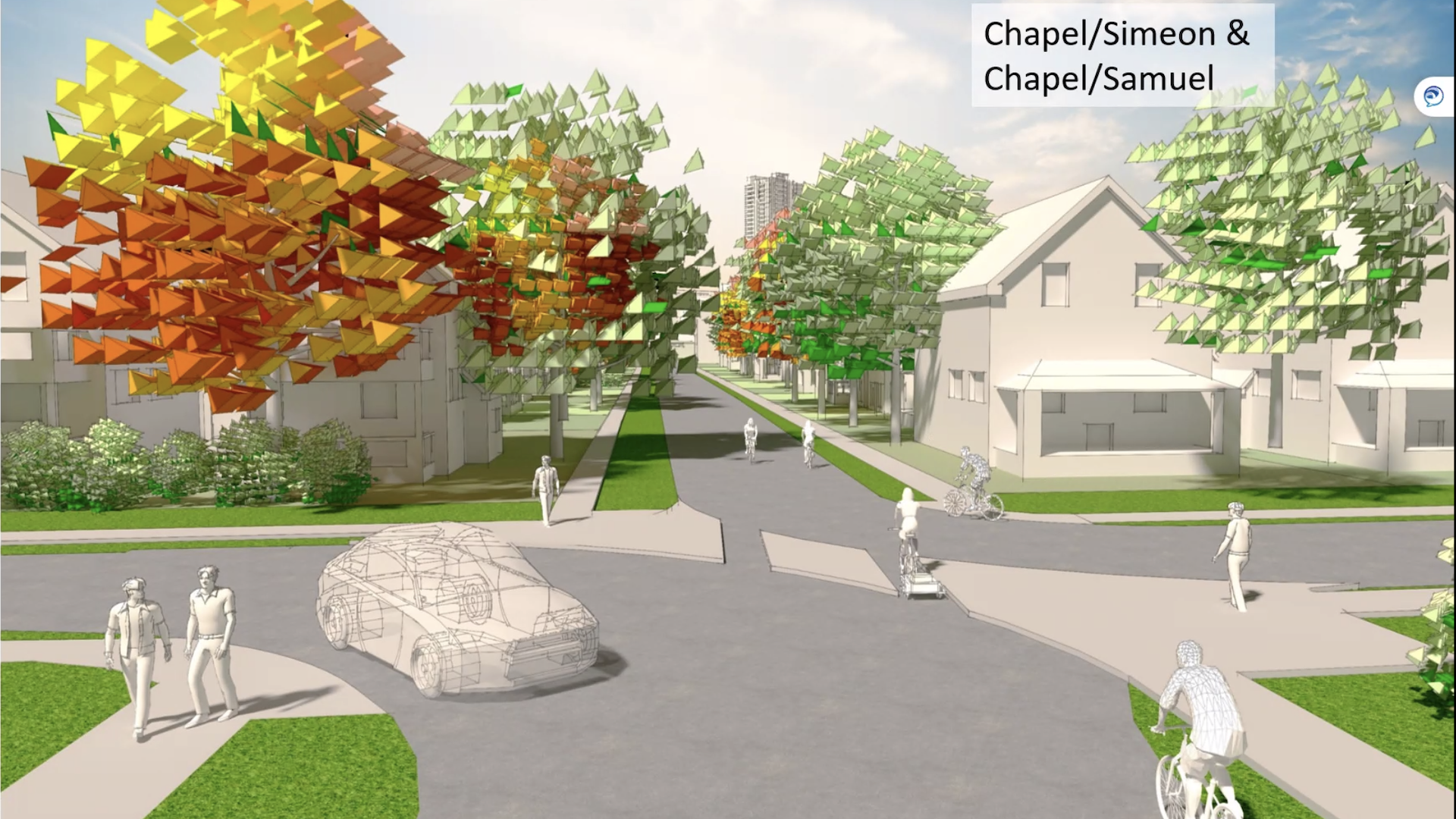
 (A rendering of a neighbourhood bikeway, which prevents cars from cutting through some neighbourhood streets, but not bicycles or pedestrians.)
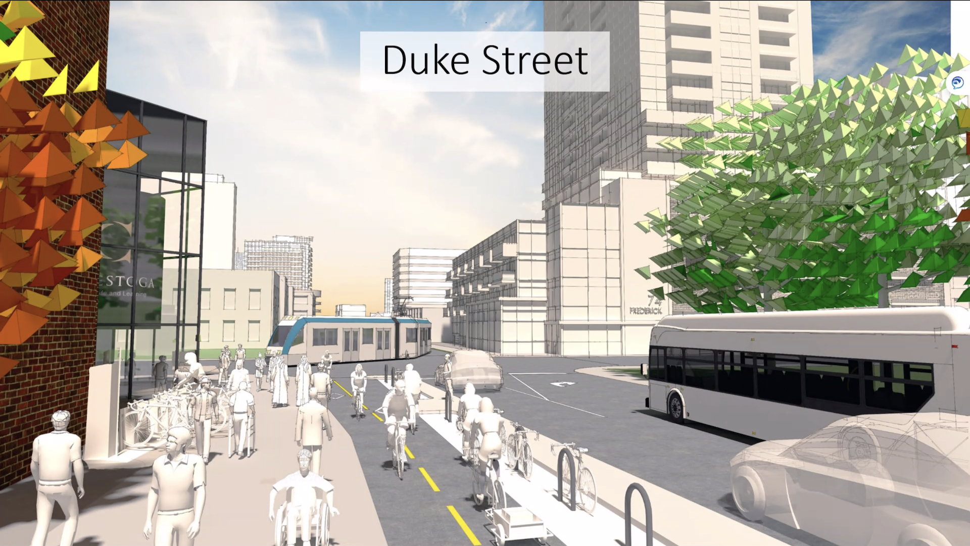
That shift in mindset has changed the way the City of Kitchener has designed streets, from policy changes around building complete streets and creating a new cycling network downtown, to the city’s new cycling and trails master plan that council approved Oct. 26. All of those change how streets are now designed to better reflect how citizens are using them. The changes include a new cycle track on Stirling Avenue that will open next year, creating several bi-directional bike lanes on downtown streets, adding protected intersections and floating bus stops, creating neighbourhood bikeways, which essentially turns some neighbourhood streets into cul de sacs, preventing cars from cutting through but not bicycles or pedestrians, and designing suburban streets to naturally calm traffic, such as making streets more narrow.
He pointed to Sims Estate Drive as an example. The street was designed to be wide with good intentions — to give cars space to swerve without hitting a pedestrian on the sidewalk.
“But what that didn’t consider was the user experience and what happens psychologically when you have that extra space to maneuver,” said Kropf. “I think we’ve all been on streets where the sign says 50 km/h but everything about the street tells us, ‘This is really comfortable to drive 60, 70 km/h.’ So we’re fighting our own psychologically to stay at that speed.”
Kitchener isn’t the only city changing the way it approaches street design.
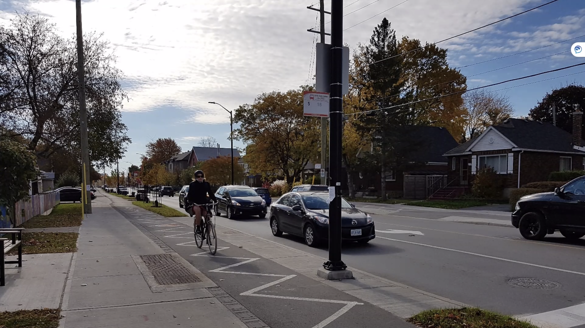
 (A street in Ottawa that was re-designed from four lanes to two, adding separate cycle lanes, a boulevard, and separate left-hand turning lanes to help move traffic.)
The City of Ottawa revamped a four-lane road to two lanes with separate left-turning lanes. The new design now considers all users: It includes boulevards, a cycling track, and trees to shade pedestrians and people waiting at bus stops. At the time, suburban commuters worried the changes would create congestion, adding to their commuting time. But with separate left-turning lanes the new design carries almost as much traffic as its predecessor, and only added two minutes to what was previously a 25-minute commute. That extra two minutes, Kropf said, was due to traffic calming — there wasn’t space for cars to speed anymore.
Where transportation designers once started street design from the inside out, their design thinking has now shifted so that streets are designed from the outside in.
Previous design thinking would start with how many cars a road needs to carry, which would dictate how many lanes it needs to have. Pedestrians would get any space leftover.
“It’s a design shift that’s happening now where you have to put pedestrians first. What type of experience do we want for pedestrians and you have to design from the outside in. So we started thinking about the pedestrian realm, cycling, trees, boulevard space, and whatever is leftover is space for cars,” said Kropf.
“This is a pretty significant design shift that’s happened and is happening. This isn’t a war on cars. We’re still making sure cars can move.”
This isn’t the first time Kropf has talked to UX designers about street design. In 2019, he spoke at Fluxible Conference about designing streets for all. He also led a Fluxible Meetup where he gave a cycling tour of the city.


