Laura MacNeil was living in Grenada and saw how farmers struggled to sell their fresh produce when it struck her: What they really needed was a virtual marketplace where they could showcase their produce to supermarkets, hotels, and restaurants.
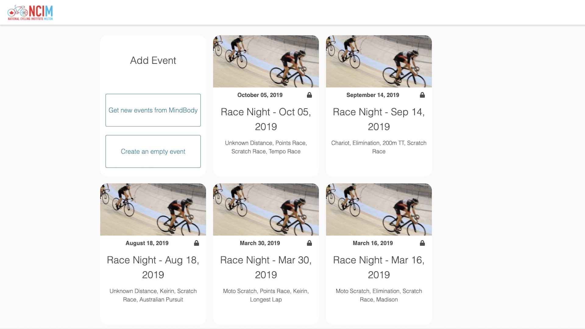
Still in its early days, MacNeil showed a marketplace prototype called carib.farm during uxWaterloo’s community shorts, where UX designers with a connection to Waterloo Region share their work.
“Living in the Caribbean is different from life in Canada,” said MacNeil.
A virtual marketplace in Canada means platforms such as Amazon, Kijiji, or eBay make it easy for most people to buy and sell goods. But for the 781 million adults in the world who are illiterate navigating those same platforms becomes an impossible challenge, said MacNeil. Farmers in the Caribbean who have low literacy levels face the same struggles.
“This puts them at a disadvantage in the marketplace, but we could be on the cusp of a solution, a way to level the playing field. Voice interface has the potential to bring accessibility to almost all users,” she said.
With that in mind, MacNeil demonstrated a simple virtual marketplace prototype that uses a voice interface to help farmers showcase their goods.
MacNeil was one of five presenters during the uxWaterloo meetup. The others were:
Leveraging behavioural insights
Janna Cameron, experience research manager at McAfee, talked about her approach to leveraging behavioural insights as part of the innovation process. She took participants through doing a behavioural barrier review, using an idea she had for a parking service app for high school students. During the review, Cameron said to go through each action you expect users to take and talk as a team about which behavioural barriers, such as decision paralysis, may apply.
“You don't want to look at the whole app at once because it’s easy to focus on the top things that are problems,” she said.
In each scenario, talk as a team about potential problems that might prevent people from doing what you want them to do. Then brainstorm which steps you would remove or change to make it easier for users.
“A great tip I got from one of my mentors is that the secret to success for any UI that you make is minimizing what you ask from your users,” said Cameron. “The less behavioural change you require the better.”
Remote UX design
Jeff Bos, an interaction designer at Christie Digital, presented a case study of doing remote usability testing on a software product that projects images into one common display in a board room. Christie is known for cinema and its work projecting images onto large structures, but in the case study Bos presented, the challenge was to build something similar for a board room. The environment was smaller, but the challenges were the same, compounded by the fact that all designing, testing, and changes had to be done remotely.
The team strategically picked people who were already familiar with the equipment to test their prototype and had developers run usability tests so that they could see and hear for themselves what users were saying.
“Communication was really central here,” said Bos. “Trust is key when you’re building something this complicated and iterating on it very quickly. It’s important that everyone involved believes in each other.”
Data driven experience design
Parvathi Varma, a UX data analyst at McAfee, talked about her work using data to improve customer experiences. When she looked into how many people tried to create a McAfee account, Varma found that nearly half tried several times to create an account, but then stopped before they were done. Curious about what was happening in the user experience, she reached out to some of those people and learned they were confused because they kept seeing the same page, and mistakenly thought they needed to keep trying again. But the real problem was a software bug that the team hadn’t yet discovered or flagged with an error message to help users along the way.
“It might seem like a small issue, but this is an onboarding page and you don’t want to lose users at that stage because it’s really hard to get them back,” she said.
Climbing the UX maturity ladder
Joanne Lau, a UX designer at a design and UX consultancy in Sweden, talked about her recent assignment working at a company with low UX maturity. Lau was designing a mobile app for machine operators in factories.
When she first started, the company was still fairly new to UX. Users had no input before things were built. Instead the company relied on sales people and training to sell their product and then users had to figure it out. But over time the company increased its UX maturity.
At first Lau didn’t have access to users and was using online forums to do UX research. But as she kept showing little bits of value, she eventually got access to some customers for interviews. Now that the company has seen the value of UX, they have a dedicated UX budget, and a global reference group for UX research. They also take the time to validate their products with customers before building something. And they have a team focused on design systems and patterns.
“It was hard to almost imagine when we started out in the beginning,” said Lau. “It’s been really interesting to see the company change over the years.”
While it was a good opportunity to shape and influence process in an organization new to UX, Lau said she learned a few things along the way: choose where you put your efforts so the work doesn’t feel overwhelming, and invite stakeholders and developers to user research sessions so they can understand the value of it.
uxWaterloo is the local chapter of the Interaction Design Association and part of Communitech’s peer to peer groups. The group will run another community shorts session in the coming months. If you want to present at the next uxWaterloo community shorts, check out the uxWaterloo page for the next call for presentation pitches.


